This is an updated version of an essay originally written in 2013.
It was first published by Rockport Publishers.

… on commence par attaquer une république et l’on finit par détrousser une diligence.
… one begins by attacking a Republic, and ends by robbing a stage coach.
Victor Hugo, “Ninety-Three (Quatrevingt-treize),” 1874, Part Three, Book Second, Chapter II
In 1966, film director Jaques Rivette conducted an interview with fellow director Jean Renoir (son of Impressionist painter Pierre Auguste Renoir). The videos (Part One and Part Two) display Renoir’s litany of how technical progress in art always ends in a state of decadence.
It sometimes makes me wonder whether man’s gift for beauty isn’t in spite of himself. His intelligence — What a devastating force! Intelligence is terrible. It makes us do stupid things. What if intelligence pushes us towards ugliness? What if intelligence makes us slaves, admirers of all that is ugly?
I wonder whether in primitive times, all objects, not just art, were beautiful. It’s a disturbing question. When we look at ancient Etruscan pottery, it’s all beautiful. And don’t tell me that every Etruscan potter was a genius!
Why is it that when technique is primitive, everything is beautiful, and when technique is perfected, almost everything is ugly, except things created by an artist talented enough to overcome technique?
It’s a disturbing question.
Disturbing indeed. Especially as it’s easy to see parallels between the everyday productivity of an Etruscan potter and today’s designer. And between the way contemporary designers admire vernacular typography and (mis-)printing, and how Renoir looks at old pots.
These parallels begin to make a case that we, designers for commerce, designers in culture, designers of objects and brands, might be in a state of decadence.
Technically, a decadent style is only such in relation to a classic style. It is simply a further development of a classic style, a further specialization, the homogeneous, in Spencerian phraseology, having become heterogeneous. The first is beautiful because the parts are subordinated to the whole; the second is beautiful because the whole is subordinated to the parts. … Roman architecture is classic, to become in its Byzantine developments completely decadent, and St. Mark’s is the perfected type of decadence in art; pure early Gothic is classic in the highest degree, while later Gothic, grown weary of the commonplaces of structure, is again decadent. In each case the earlier and classic manner–for the classic manner, being more closely related to the ends of utility, must always be earlier–subordinates the parts to the whole, and strives after those virtues which the whole may best express; the later manner depreciates the importance of the whole for the benefit of its parts, and strives after the virtues of individualism. All art is the rising and falling of the slopes of a rhythmic curve between these two classic and decadent extremes.
Decadence suggests to us going down, falling, decay. If we walk down a real hill we do not feel that we commit a more wicked act than when we walked up it. But if it is a figurative hill then we view Hell at the bottom. … An age of social decadence is not only the age of sinners and degenerates, but of saints and martyrs, and decadent Rome produced an Antoninus as well as a Heliogabalus. No doubt social “corruption” and literary “corruption” tend to go together; an age of individualism is usually an age of artistic decadence…
Havelock Ellis, “Introduction to Against the Grain (A Rebours)” by J.-K. Huysmans, 1884
The cycle of heroic growth and refinement, followed by a descent into decadence is an old motif — probably going back to when Man first started scratching onto cave walls. But first, please don’t think that the use of “decadence” is a simple reference to Caligulan extravagance and sexual practice. It isn’t. Decadence has more nuance than simple self-indulgence.
Decadence is a kind of forgetting.
If one places Ethics and Aesthetics in opposition, where ethics is roughly “the reason” and aesthetics is “the affect,” we have a simple scale where we can place decadence more towards the aesthetic. And that diametric can shed light on the value of a work.
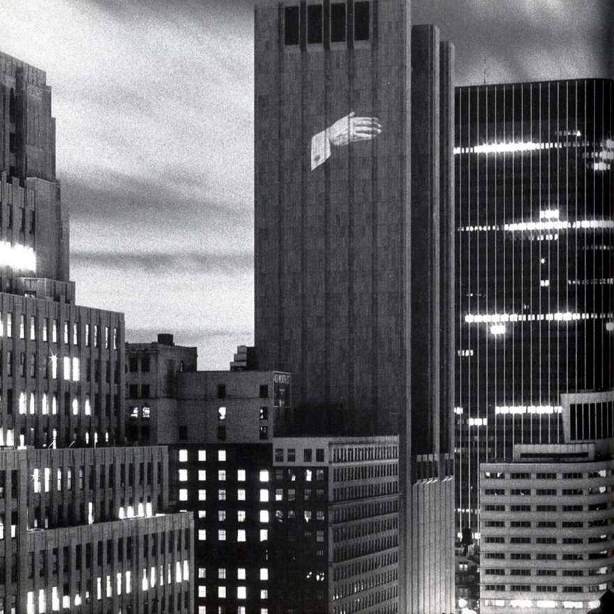
For example, take the work of artist Krzysztof Wodiczko, known for large-scale projections on buildings and monuments. His most well-known piece projected the well-dressed, well-cufflinked hand of then-president Ronald Reagan, in Pledge of Allegiance mode, onto the side of a large, windowless building owned by AT&T located in the northern part of the Financial District. This combination of symbols and its appearance several days before the 1984 presidential election, was an early critique of the unholy mix of right-wing Christian, neo-conservative corporatism.


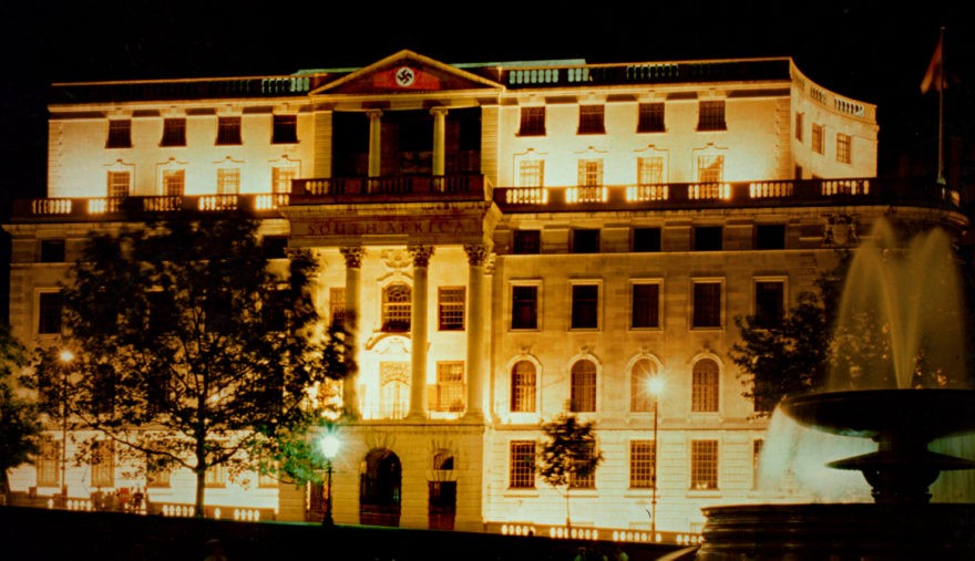
A 1985 project in Trafalgar Square was approved only as a two-day projection onto Nelson’s column. But on the second day, Wodiczko redirected one projector towards a seal on the tympanum of South Africa House across the way, superimposing the image of a Nazi swastika. South Africa at the time was still under apartheid.
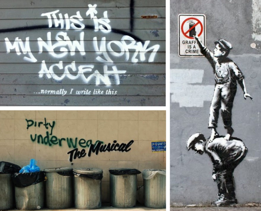
Currently, New York City is the chosen exhibition space of the street artist known as Banksy. Each day, a new piece is announced on his Instagram account, scurrying hipsters, bloggers and wannabes in a frantic search to photodocument the work before it either is defaced, cut out of the wall by the building owner and sold, or moves. The pieces are little more than comfort food for the faux-opposition, a slight validation ritual for both viewer and artist, eliciting little more than a brief pout once they are tagged over.

Both Wodiczko and Banksy built their reputation in the street. And both artist’s work can be astonishing, if not downright magical. But their affect, the bit that sticks in the mind afterward is quite different. Wodiczko appeared on the New York scene in the early 1980s, at the height of a classic era in street art, transforming what was a simple gesture of presence — I’m alive! — to vital and elegant social criticism. Banksy… not so much. Ethics and aesthetics. Classicism and decadence. Again and again.
And that’s the place where our designer/branding/creative life is today. Constantly developing better software, refining OpenType flexibility, accessing more and more “inspiration” from a growing number of portfolio sites, writing cooler code, and so forth. All to the point where Google CEO Eric Schmidt stated that there were 5 exabytes of information created between the dawn of civilization through 2003, but now that amount is created every two (actually, seven) days.
So what do we creative types do with all that information? We bitch about the fucking kerning. Seriously, if you read the internet, you would get the feeling that we’re all a bunch of type nazis.
Societies develop. They do not begin. They are built on what came before, and part of the eternal cycle of growth and decline.
We had a great mythology in Modernism. And in its origins, the Bauhaus was a hotbed of wide-eyed spiritual seekers, hoping for a holistic, and non-corporate, utopia where “art is not a profession.”
Sadly, the Bauhaus now stands for the opposite. We have our efficiencies and modularities, our metrics and benchmarks. We all study to a common core and exercise the same tastes. We design to creative briefs written for the executive suite rather than for the underpaid slobs who actually make the thing. And we all comfort ourselves with the “breathless bullshit” of self-help bromides and TED Talks.
We celebrate that which minimizes us: emphasis on the new, cults of personality, and ornamentation disguised as insight. Thoughtfulness is rare in our design practice.
Architects see someone who designs their first building while in their 50s as young because it takes that long to build proficiency. And that process tends to follow an apprenticeship model — a model which graphic design and advertising used to follow.
Art direction cannot be properly taught in school because it is a social practice as well as an executional one. Oral tradition is how you make a proper art director. Show and tell… mentorship… these all take time, and are dismissed as expensive.
Now, we have an environment where a great emptying is sweeping across companies. Creative departments are polarized to the point where upper management is supported by junior designers and interns, and not much else. And companies hire celebrities as creative directors, in name only.
So in that vacuum, who helps determine design practice and culture? Frankly, the mob. The mob on the internet, made up of “who knows what kind of design authority they are,” as well as the general public — all racing to be the first to post. And for those who claim there are pillars of design culture, i.e. the more prominent of us, the argument is that the current competition for blog material and conference presenters turns these pillars more into swipe files, objects of jealousy or fountains of comforting bromides than ethical models.
Perhaps one problem is that we never really began with a truly-heroic origin myth. Nope, marketing isn’t really the highest of motivations. And I guess we don’t have that many (proper) historical titans to wrestle with. Look at architects. They still battle it out with the likes of Palladio and Wren.
But every decline is followed by a rise. My heart was gladdened by the Occupy movement. Though I don’t expect immediate action, because the pendulum swings slowly, I’m happy to know that thoughtfulness and passion lives somewhere.
And there have been other nascent stirrings, most notably the second time around for the First Things First Manifesto in 2000. But as I re-read First Things First, I’m struck by how narrow and schoolmarmish it is.
“We propose a reversal of priorities in favor of more useful, lasting and democratic forms of communication — a mindshift away from product marketing and toward the exploration and production of a new kind of meaning. The scope of debate is shrinking; it must expand. Consumerism is running uncontested; it must be challenged by other perspectives expressed, in part, through the visual languages and resources of design.” — First Things First Manifesto 2000, Various authors
Really? Your awesome poster design is going to turn capitalist America around? It certainly hasn’t done much for all the Hurricane Sandy relief efforts.
Let me suggest this… Writers from Michel de Montaigne to Leo Tolstoy suggest that rather than try to change the world, we change ourselves.
Design is a social activity. One in which We. Make. Culture. Yes, even the most introverted typographers. And I bet, that deep down, this is the result which drew us to this profession. So perhaps we can stop periodically, refrain from hateposting on the logo contretemps du jour, and try to see the larger context of design — beyond mere skill and aesthetics. Because most of the distractions around us — the Banksy, the University of California logo, the Yahoo! logo, the Command X game show, the wondering if flat design is truly the future — only makes us forget ourselves.