This is an updated version of an article which first appeared in 2008 on the Landor Associates website.
In his 1958 essay “Who Cares If You Listen,” the American serialist composer Milton Babbitt (1916-2011) recognized that “‘serious,’ ‘advanced,’ contemporary music” no longer appealed to the general public – reaching a point where it was performed “primarily at poorly attended concerts before an audience consisting in the main of fellow ‘professionals.’ At best, the music would appear to be for, of, and by specialists.”
The specialist can learn or appropriate from the common man, but things rarely work in the reverse; which Babbitt colorfully expresses at the end of his article: “Admittedly, if this music is not supported, the whistling repertory of the man in the street will be little affected…”
A favorite conversational topic of graphic designers is the litany of hated typefaces. Usually found in various Microsoft operating systems – and consequently used by the majority of computer users – they are brandished with great enthusiasm, and rarely with the specialist’s rigor.
But rather than dismiss this style of typography, let’s celebrate it, and use it as a home-grown focus group. Consider it an endorsement of the decorative, as a desire for vivid graphic expression rather than acres of white space, as permission not to be cool.
The average man doesn’t know what designers know. He’s free of design culture and its rules and restrictions. He hasn’t a care for whether his type choices are in fashion. He has orders to fill and suppliers to pay.
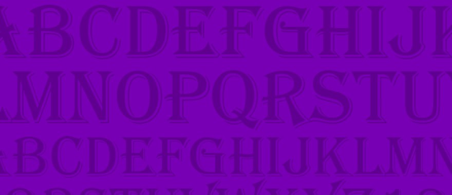
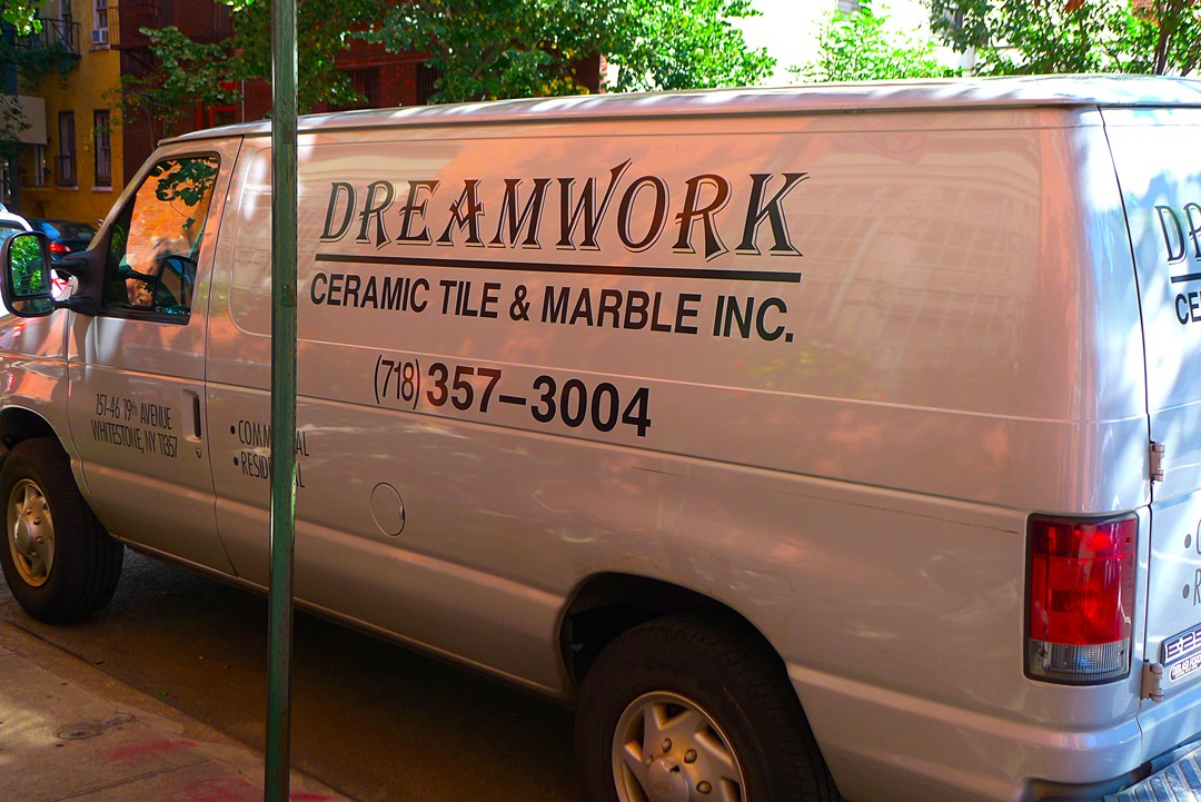
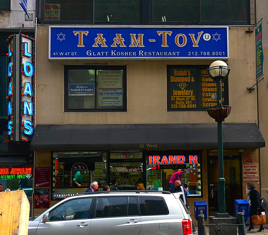
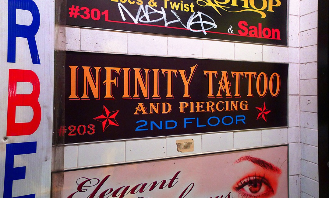
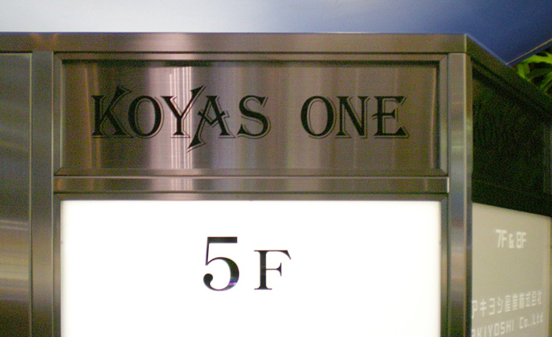
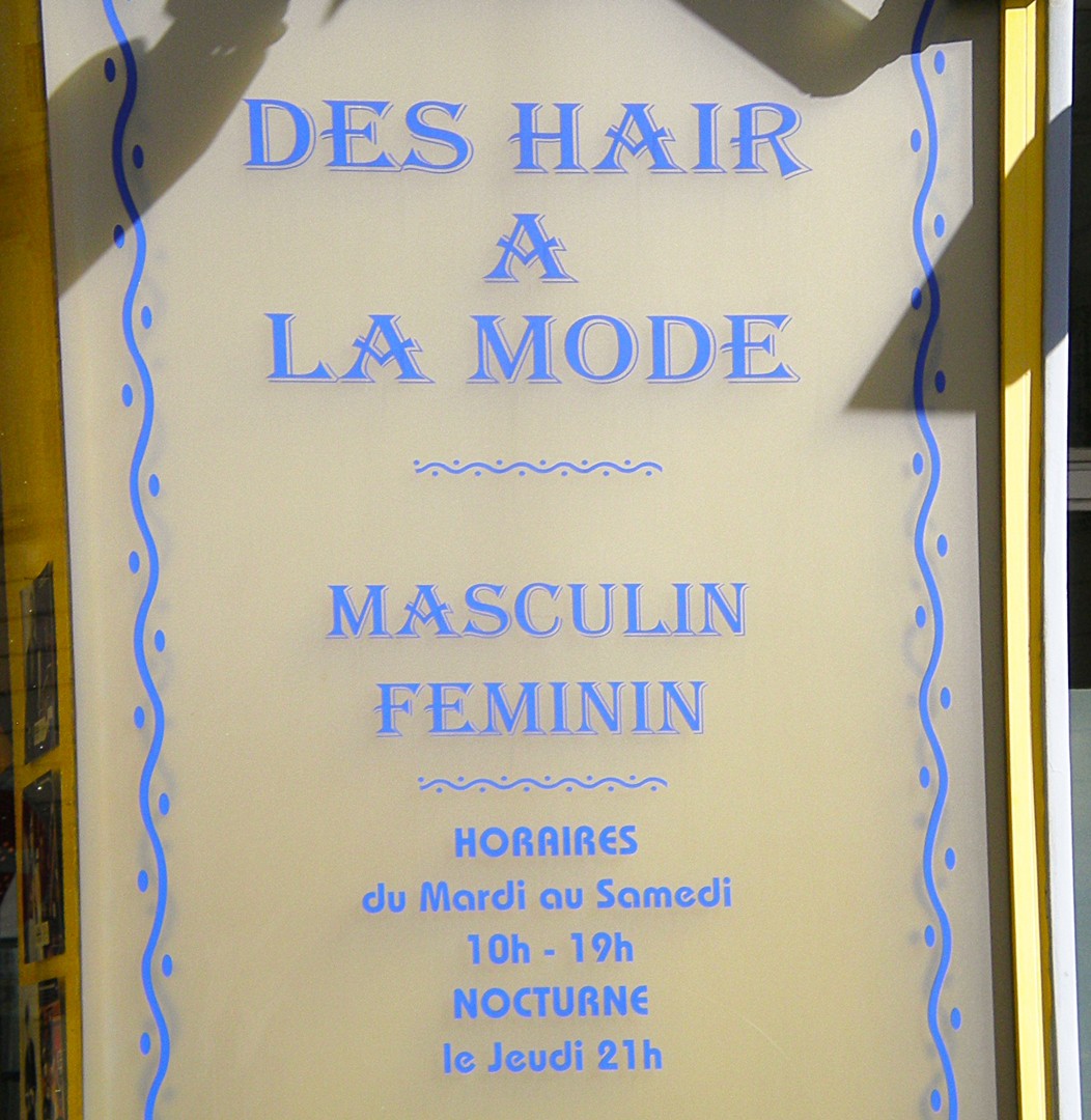
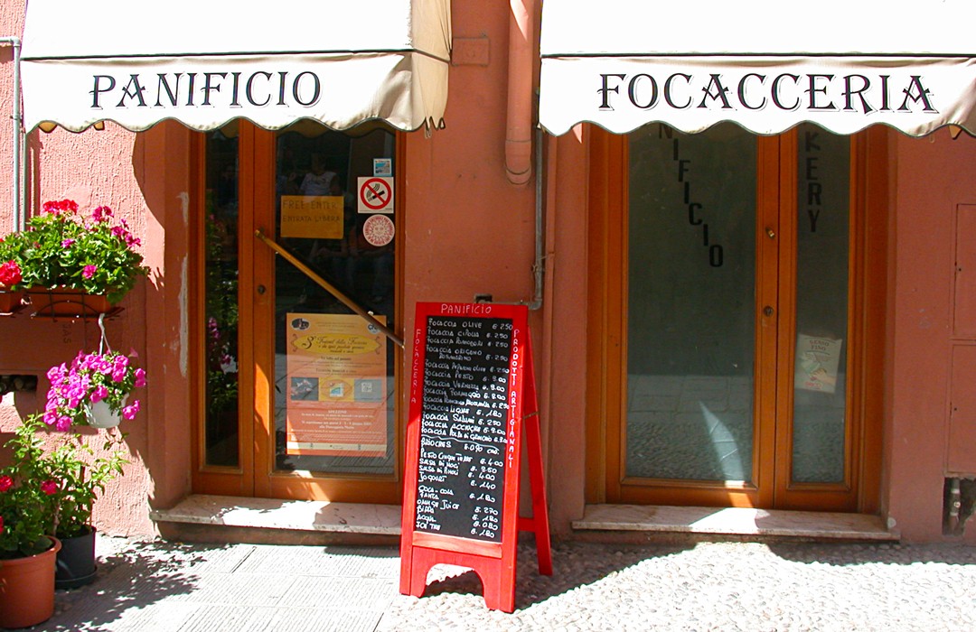
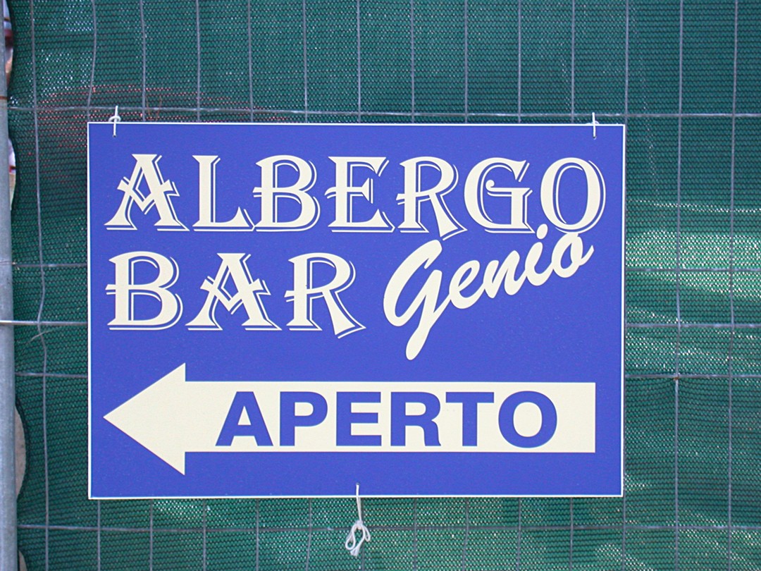
He doesn’t have to use Gotham. He could choose… Algerian.
Introduced by the British foundry Stephenson Blake and Co. around 1908*, Algerian was redrawn by Philip Kelly for Letraset in 1968, digitized by URW, and began appearing in Microsoft software products around 1997.
It’s on everyone’s computer. All you have to do is click on “Font”… and, boom, there it is, right at the beginning of the alphabet. Instant wordmark. Works in every culture and is vaguely suggestive of something personal, something different.
Back in the heyday of Modernist graphic design, Helvetica was the king of typefaces – applied to all aspects of corporate identity, from invoices to the sides of airplanes – destined to rule the archeological record of our society. Now, I’m not so sure. The typeface that originally evoked a vague Spanish/Moorish exoticism has now become the face of, not industry, but the whistling repertory of the common man — each composition reflecting a unique take on how people speak to each other. And it’s a smart designer who looks for something of value in that tune.


* Roy Millington, “Stephenson Blake The Last of the Old English Typefounders,” Oak Knoll Press, The British Library, London, 2002.