Blue Note Records has a complicated relationship with their history as a genre-defining jazz institution. The name is shorthand for certain standards of taste: post-bop jazz, excellent sound quality, well-dressed musicians, innovative graphic design and iconic photographic style. But, their iconic look and feel is easily appropriated.
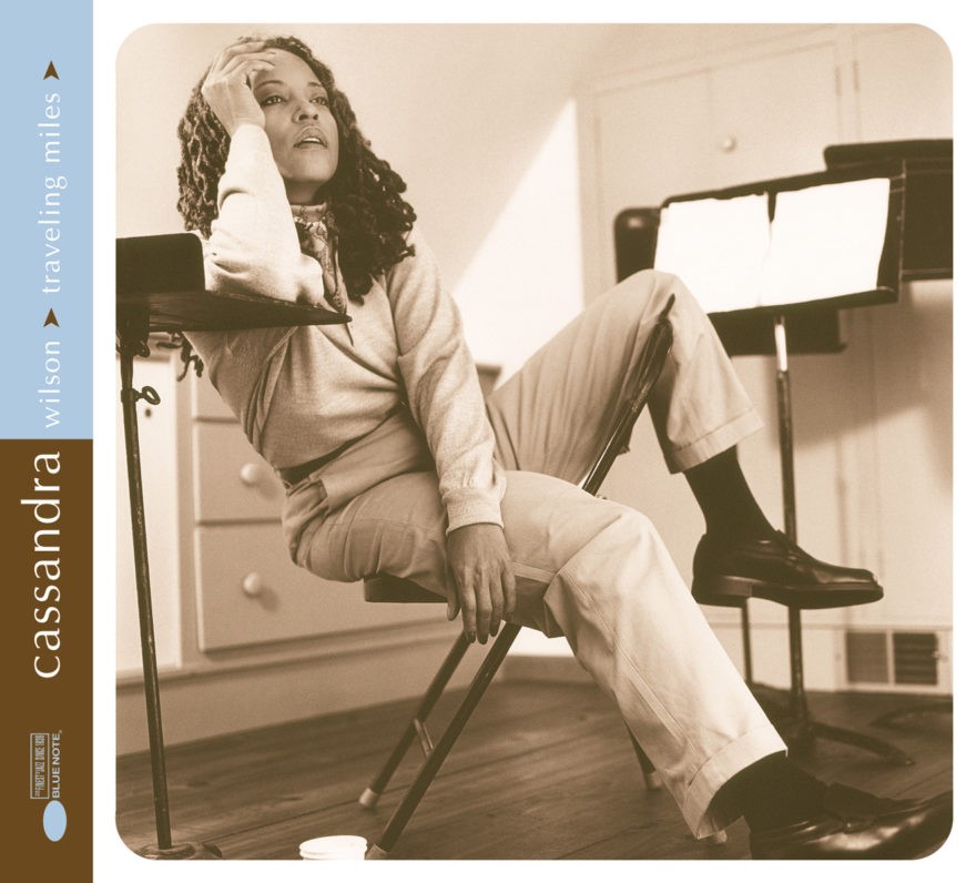
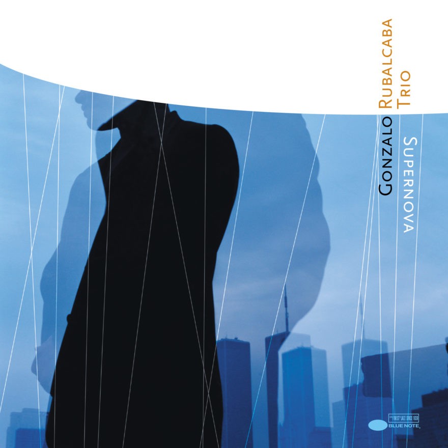
When done reverently, such appropriation can have an interesting edge. Cassandra Wilson’s tribute to Miles Davis boldly features her in Miles Davis “drag.” And the Winter Sampler is an insider’s wink to the cover of Tony Williams’ Spring.
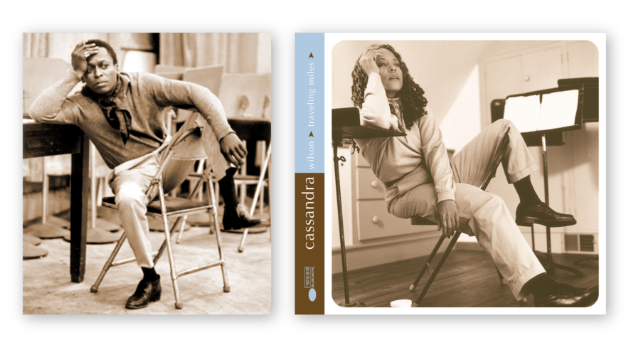
Right: Cassandra Wilson, photograph by Joanne Savio
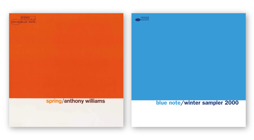
Right: Blue Note Winter Sampler, design by Mark Kingsley
And there are times when the appropriation of style seems respectful.
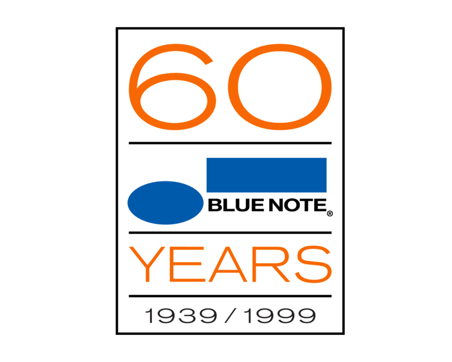
When we were approached to design the logo for Blue Note’s 60th anniversary, the most appropriate response was through the humility of visual archaeology. In other words, search for a logo away from one’s taste. In this instance, all we had to do was look at the shape of the number 60 and find the appropriate stand-in.
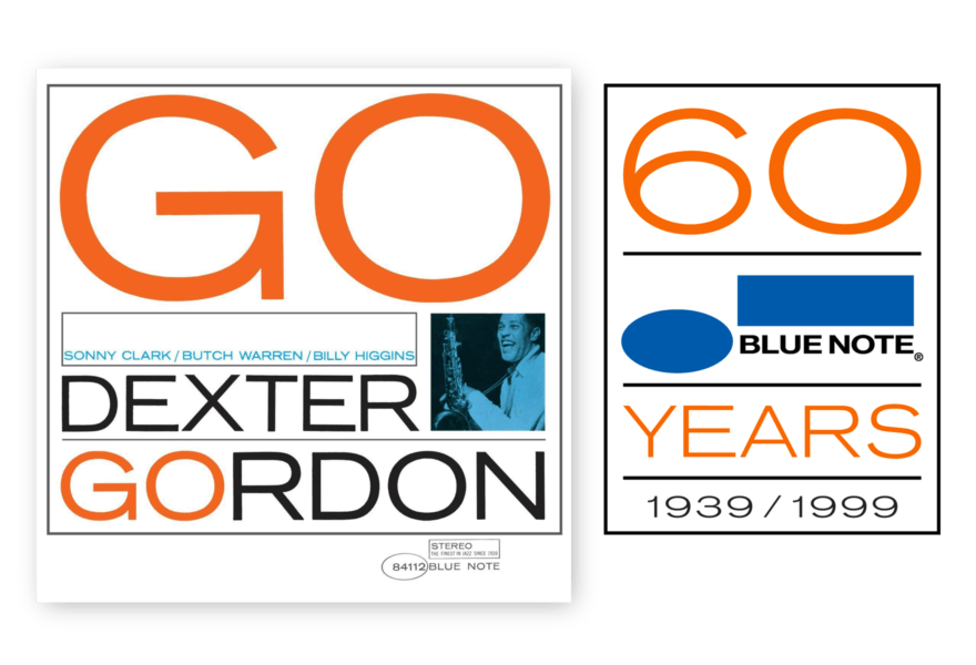
Right: Blue Note 60 Years, design by Mark Kingsley
Voila. The quickest, easiest logo approval ever. And we only showed one option.
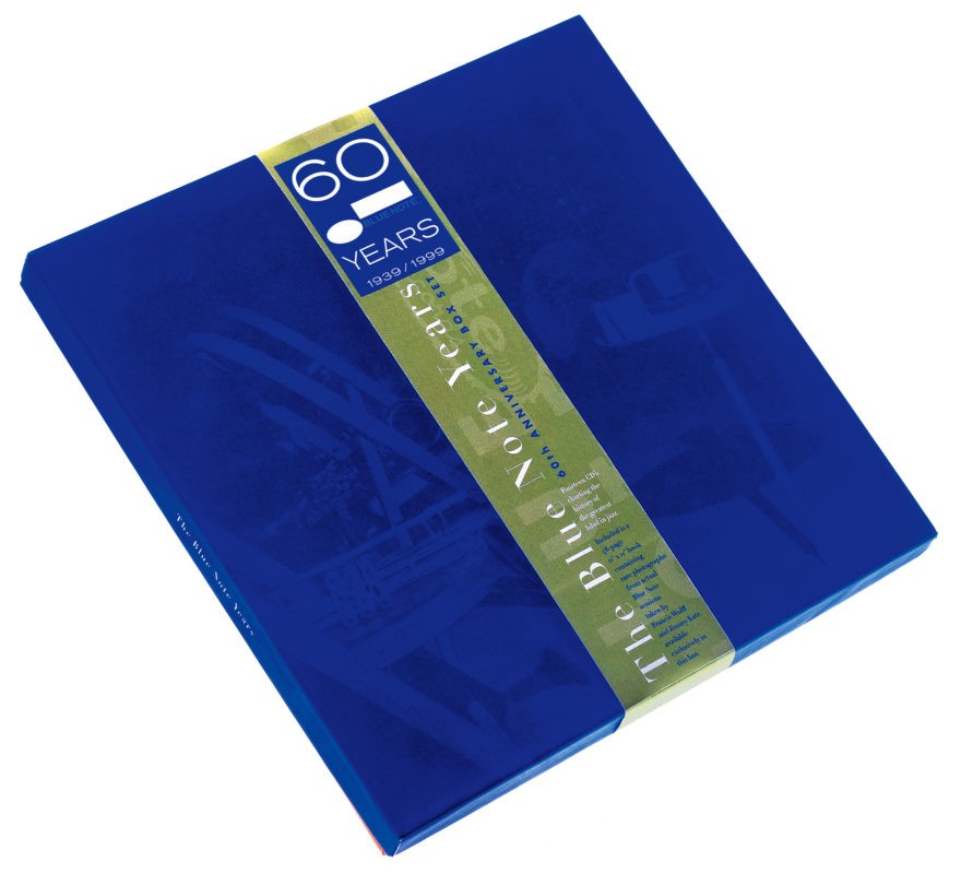
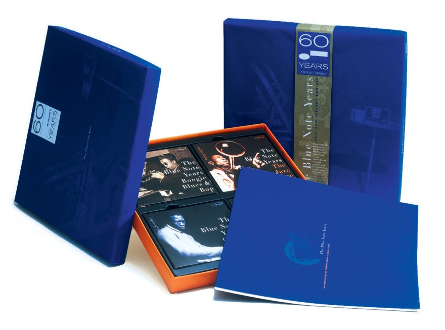
The second part of the project was to design a 60th Anniversary box set for seven two-disc sets and a 48-page picture book. The CD sets would be sold separately, so graphically, they had to have a stand-alone quality: with full titles and UPC codes. Because tinted black & white photographs made up the famous Blue Note photographic style, most of the design moves were variations on tinting and color.
Since there wasn’t much of a budget for anything other than ink on paper, we conveyed luxury through classic ink and press trickery. Once again, our method came from Blue Note’s history.
Many of designer Reid Miles’ covers used a technique we affectionately called “the poor man’s duotone.” The duotone is a color separation technique which integrates a second color to a black & white image for a more gradual transition from highlight to shadow. The added color also tints the resulting image. During Mile’s time, the duotone was subject to the person making the printing plates, requiring a combination of specialized equipment and skill – all with corresponding up-charges.
The poor-man’s duotone just lays black ink over an area of flat color.
Our approach was a variation on the poor man’s duotone known as a double-hit. A flat area of Pantone blue was laid down, and then the image was sur-printed in the same color. Since most inks used in offset printing are translucent (due to environmental regulations) there’s a thinness to flat areas of color. But when a color is double-hit, it gains a richness and depth usually reserved for lacquer-based inks.
This was the trick we used throughout. Maximum effect for minimum cost.
Structurally, there was an inherent division to the set which was the result of a dormant period between 1979, when EMI phased out the label in the face of falling jazz sales, and its relaunch in 1985. This was reflected in the picture book, split between Francis Wolff’s iconic photos and Jimmy Katz’s images for the new Blue Note. So to subtly suggest this difference, every image taken prior to 1979 was sepia tinted, and everything after 1985 was tinted blue.
Since they had to stand alone, the individual two-disc packages were tinted according to subject matter. Because the photographs were taken over a 60-year period, and with a wide range of film stock and lighting conditions, coherence was achieved through a consistent layout.
This was a limited run of less than 3000 box sets. Recently, we’ve been happy to see that our reverence for production details and the label’s history is reflected in the resale market. Currently, unwrapped copies are selling for close to $1000 US.
