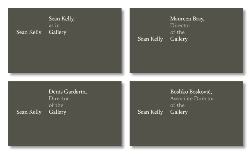
Since opening in 1991 Sean Kelly Gallery quietly became one of the most respected galleries in New York City. And over the years, the gallery’s distinct sensibility – both intellectually and aesthetically rigorous – has made it a major presence in the global market.
The gallery’s previous identity was designed by Joseph Kosuth, one of the more influential contemporary artists and a personal hero. Known as a founding figure in conceptual art, Kosuth’s language-based work was, at the time, executed in an idiosyncratic approach to typography where letterforms are artificially compressed in an attempt to visually “raise the volume.” This typographic style extended into the previous gallery identity, so besides legibility and production issues, there was an inherent problem in using one artist’s style to present others.
Typography aside, there was still value in Kosuth’s tendencies towards philosophical inquiry, subtle humor, and strict color palettes.
The process began with the basic question of “what do we know?”
We knew the stable of artists, including: Marina Abramovic, Laurie Anderson, James Casebere, Antony Gormley, Ann Hamilton, Rebecca Horn, Callum Innes, The Robert Mapplethorpe Estate, Anthony McCall, Gavin Turk, and of course, Joseph Kosuth.
We knew the gallery’s history of museum-quality exhibitions:
Primitivism Revisited: After the End of an Idea
Marina Abramović: Seven Easy Pieces
Mapplethorpe Neoclassicism
The Furniture of Poul Kjærholm and Selected Art Work
Remarks On Color
Man Ray/Duchamp: Fifty Years of Alchemy
Chantal Akerman: Selfportrait/Autobiography: a work in progress
From Kosuth, we knew the color grey.
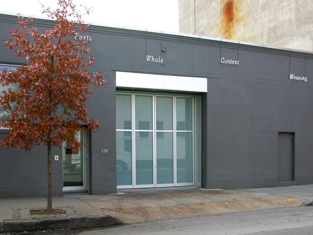
We knew something about the typical Sean Kelly show:
Intellectual.
Serious (but not dull).
A destination.
We knew the gallery’s character.
Elegant.
Refined.
Platonic.
We knew things about Sean Kelly.
Born on Bloomsday.
Collects James Joyce & Marcel Duchamp.
We knew that a gallery’s point of view establishes their exhibition program, which then colors how following exhibits are perceived. For example, Marina Abramovic’s Balkan Erotic Epic would have been a different exhibit at Mary Boone than what was shown at Sean Kelly.
Therefore, the system needed to acknowledge both Sean Kelly’s and the gallery’s personality, and acknowledge their role as tastemaker and curator; as frame and stage.
And given the explosive growth of the art world – with ever-increasing numbers of artists, galleries, art fairs, and collectors – the system needed to stand out from its graphically-saturated environment. It had to be bold and it had to be different. And since there’s a surfeit of earnest and serious brands in the art world, there was room to have a bit of fun as well.
Four rules were established for the project:
Be simple.
Be playful.
Be rigorous.
Language over images and shapes – because much of the work represented is “linguistic” in some way or another.
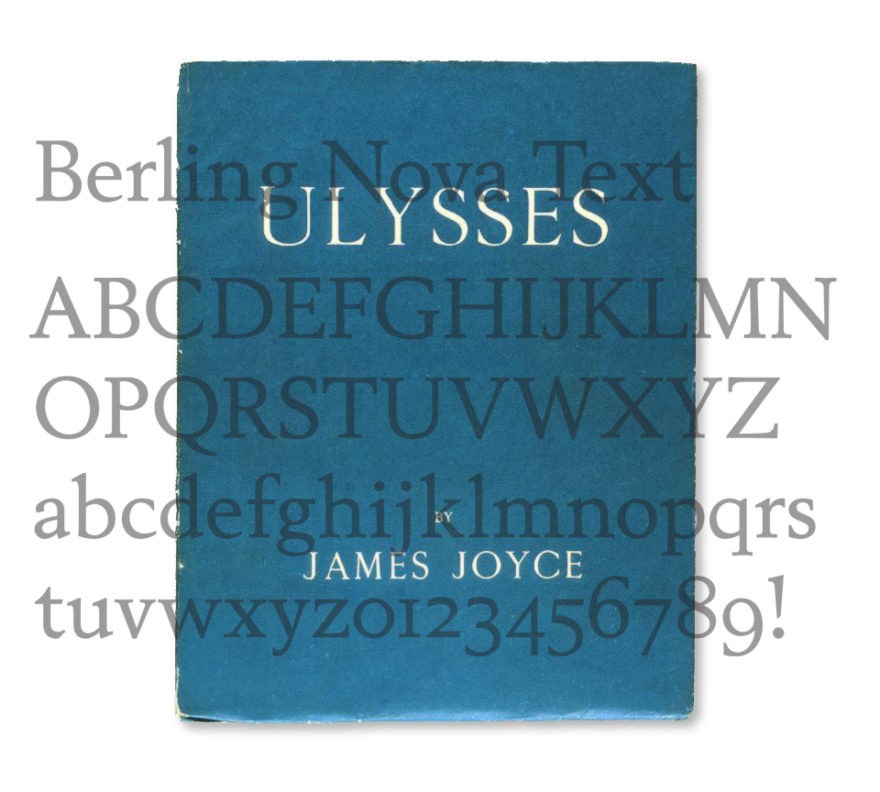
The first step was selecting a typeface which was legible, conveyed a certain classicism and confidence, and had a personal connection to Sean.
Ulysses, first printed by Maurice Darantière in Dijon, used an Elsevir typeface which was later approximated in Berling (1951–58) by noted Swedish designer Karl-Erik Forsberg, and based on fifteenth-century Venetian faces by Aldus Manutius. Even though Berling premiered twenty-nine years after Ulysses was published, it had an appropriate fidelity to Darantière’s first edition.
Then, following the four rules of the project, the system came together rather quickly.
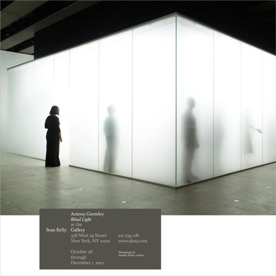
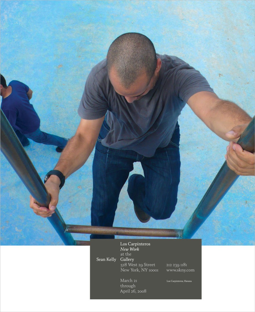
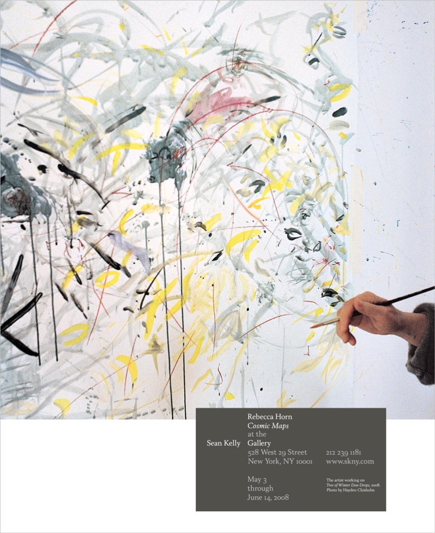
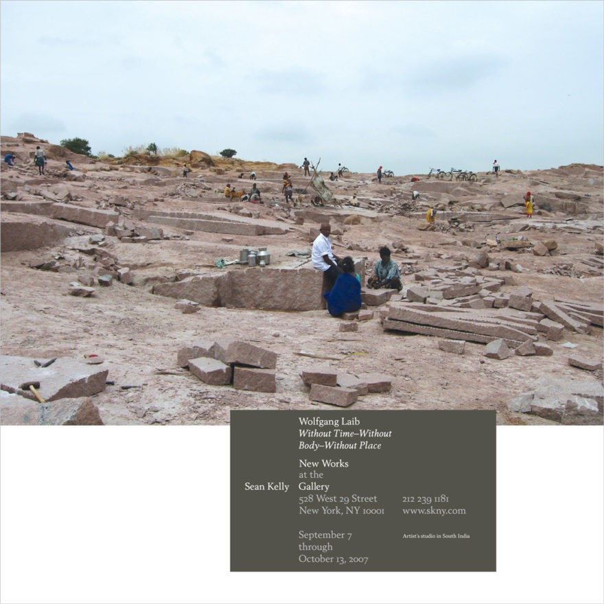
For the advertising program, all text was treated like a wall label at an art museum: off to the side, and straighforward.
