In May 1998, at the Chicago Art Fair, art dealer Sean Kelly came across a photograph which, while intriguing, he did not feel informed enough to acquire. The image continued to haunt him until the 1999 Chicago Art Fair, where miraculously the piece made a second appearance. He purchased it immediately.
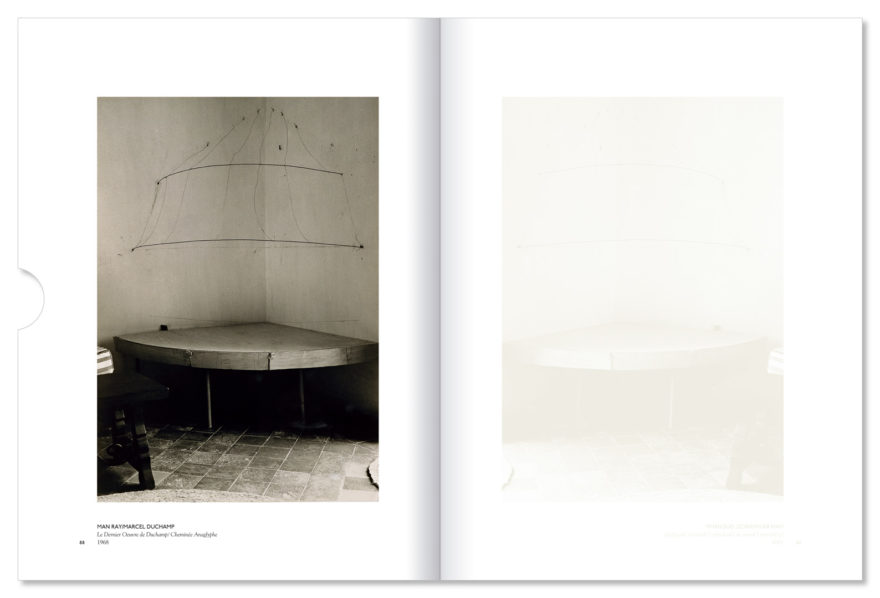
The image by Man Ray was of Cheminée anaglyphe (Anaglyphic Chimney), Marcel Duchamp’s final installation at his home in Cadaqués, Spain. On the reverse, in Man Ray’s hand was written “Le Dernier oeuvre de Duchamp, Août 1968.” That photograph of Duchamp’s last piece became the catalyst for an exhibition based on Duchamp and Man Ray’s 50-year ongoing collaboration.
Such a show deserved a proper catalogue, but it wasn’t until about four years after it closed when material and schedules aligned and we began the project. And given Duchamp’s proclivity for games, puns, and tomfoolery for the benefit of art, aesthetics and philosophy, the opportunity to do the same existed.
In acknowledgement of the four-year gap, the first design choice was based on Duchamp’s notion of the infrathin – infra-mince in French – a liminal phenomenon, which according to him was difficult to define except through examples:
- the warmth of a seat (which has just/been left) is infrathin
- when the tobacco smoke smells also of the/mouth which exhales it, the two odors marry by infrathin
- 2 forms cast in/the same mold differ from each other by an infrathin separative amount
- All “identicals” as identical as they may be (and the more identical they are) move toward this infrathin separative amount.
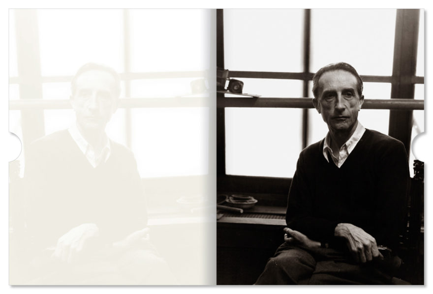
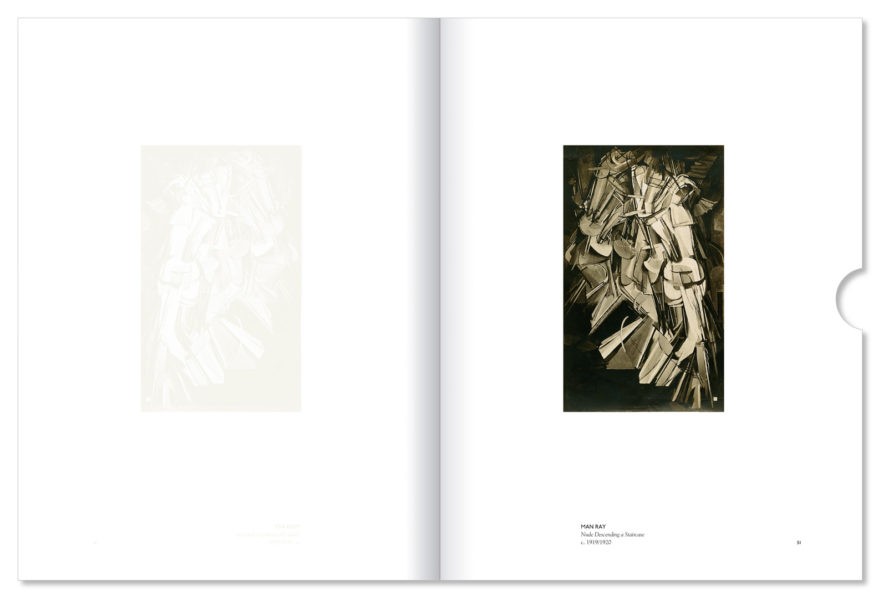
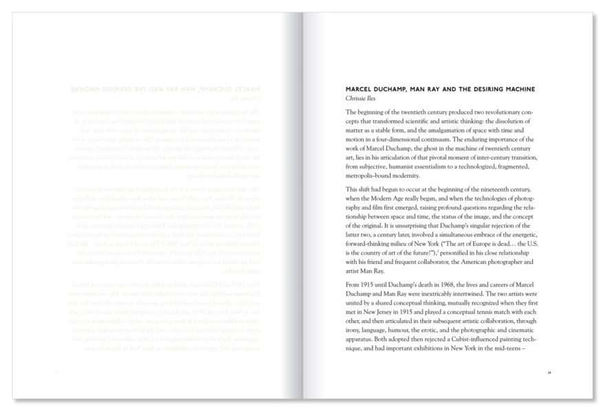
Like a sebaceous infrathin left behind on a headrest, each printed page was mirrored on the verso with a tinted varnish. In effect, half the book was invisible unless viewed in a raking light. Most of the text was a direct mirror except whenever Sean Kelly’s name was mentioned, in which case the anagram (another Duchamp strategy) Sally Knee was substituted.
Upon presenting this concept, I learned that Duchamp’s “La boîte-en-valise,” a portable mini-collection of his work handmade in multiple, contained an image of the “Bottle Rack” with a false shadow of tinted varnish. It was a sign. This approach couldn’t have been more perfect.
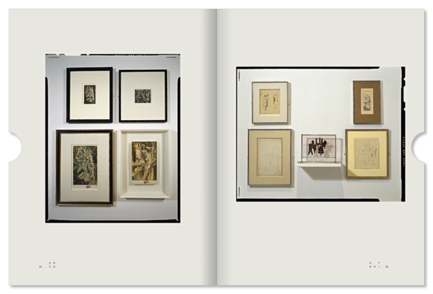
While it was well-documented, the show wasn’t photographed with a catalogue in mind. The images were of pieces in situ, with lens distortion and film grain preventing significant detail. If we could get a better photograph of a piece from the show, we did. But this process had its own set of requests and agreements – making the catalogue, in a sense, doubly curated.
In acknowledgement of their status as found objects, all in-situ images were printed full-frame, with the 4×5 chrome edges visible.
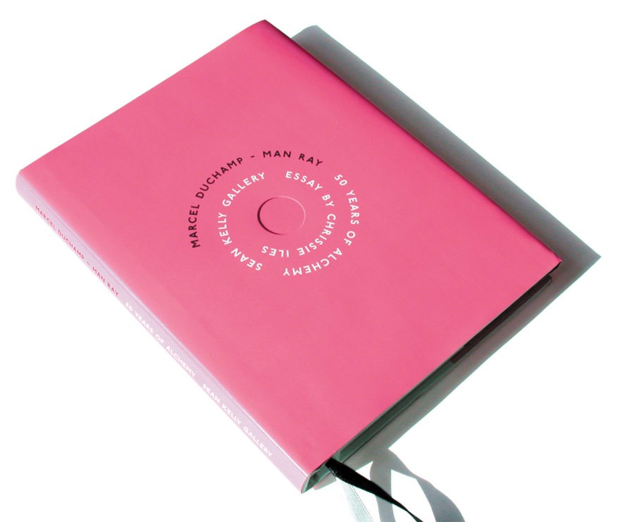
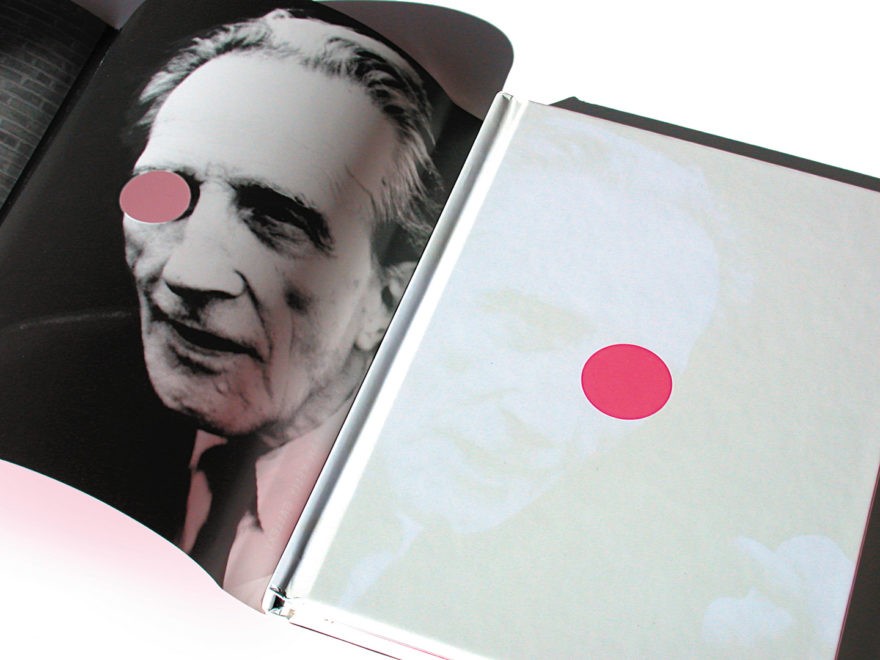
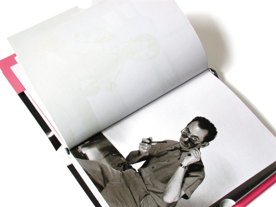
The front cover typography was laid out similar to the spinning discs of type in Duchamp and Man Ray’s collaborative film Anémic Cinéma. In the center of the title, a die-cut circle was aligned to make an Etant Donnés peep-hole in an image of Duchamp and Man Ray which was printed on the dust-jacket’s reverse.
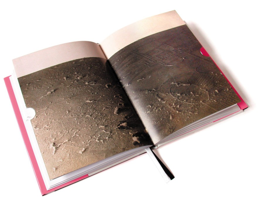
The special edition of the book was produced in an alphabetical edition of 26, all signed and numbered by Sean Kelly and Chrissie Iles, Curator of Film and Video at the Whitney Museum of Art. Each edition had an intervention where Duchamp and Man Ray’s first and last images were obscured under a layer of scratch-off ink similar to the one used on lottery cards. The only way the images could be seen would be to destroy the value of the edition by “breeding dust,” which referred to Dust Breeding, a Man Ray photograph taken during the creation of Duchamp’s seminal work The Bride Stripped Bare By Her Bachelors, Even.
All design and production decisions (both serious and farcical) were described in the colophon, which read as follows:
COLOPHON
When selecting typefaces for a book, one hopefully approaches the task with a respect for the text and a desire for clarity and readability. Little games, tricks and puns that surround decisions can come off as affectations which speak more to the designer’s ego than the subject. Thus, this designer’s dilemma.
Yet, given the subjects of Marcel Duchamp and Man Ray all strategies become permissible and hopefully, acceptable. Including…
The Chronological Imperative
Typeface selection was limited to any face initiated in 1915, the year Duchamp and Man Ray met. Goudy Oldstyle, designed by Frederic Goudy, and Edward Johnston’s face for the London Underground are by two typographic giants of the time – one European, one American. Additional justification came from a poster Man Ray created for the London Underground.
The Significant, aka The Artist Manqué
There is an anecdote (possibly apocryphal) where Duchamp describes the title of a work as its final varnish. The concepts of duality, the infra-thin and spontaneous reproduction are also “reflected” in the varnish effect.
Reflexive Mortal Arithmancy
Page dimensions are close to an antiquarian size known as the Foolscap Quarto. Exact dimensions emanate from a numerological analysis of 1968, the year Duchamp and Man Ray’s collaboration ended.
Alphabetic’l Exclusion
The special edition of this book is limited to 26 with 7 proofs.
A Rag Man’s Anagrams
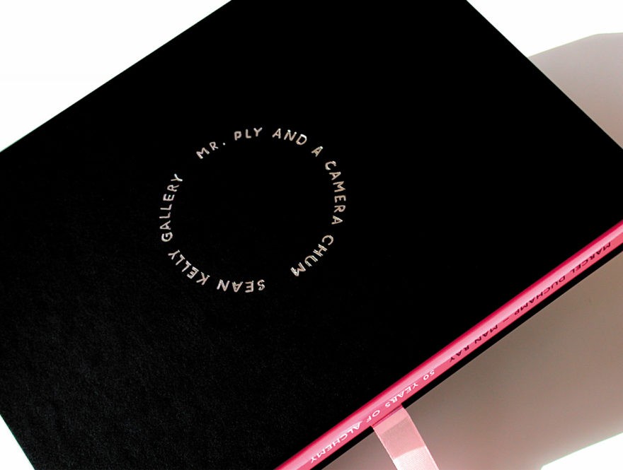
One rearrangement of the letters in “Marcel Duchamp” and “Man Ray” is Mr. Ply and a Camera Chum – the inscription on the special edition slipcase (design inspired by Duchamp’s Anémic Cinéma).
Dust Breeding (Mirrorical Return)
In the special edition, Duchamp and Man Ray’s first and last collaborations have been hidden under a layer of scratch-off ink. Only by breeding dust (and partially destroying the edition) can the images be revealed.
Mark Kingsley
June 2004
