Bang on a Can has dedicated over three decades of work towards making music new. From a one-day New York-based Marathon concert (on Mother’s Day in 1987 in a SoHo art gallery), they have grown into a multi-faceted performing arts organization with a broad range of year-round international activities.
“When we started Bang on a Can, we never imagined that our 12-hour marathon festival of mostly unknown music would morph into a giant international organization dedicated to the support of experimental music, wherever we would find it,” write Bang on a Can Co-Founders Michael Gordon, David Lang and Julia Wolfe. “But it has, and we are so gratified to be still hard at work, all these years later. The reason is really clear to us — we started this organization because we believed that making new music is a utopian act — that people needed to hear this music and they needed to hear it presented in the most persuasive way, with the best players, with the best programs, for the best listeners, in the best context.”
For the past couple decades, we have periodically branded and re-branded Bang on a Can as they have either moved offices, grown, or celebrated a significant anniversary.
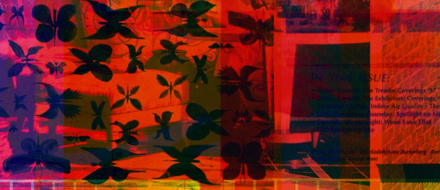
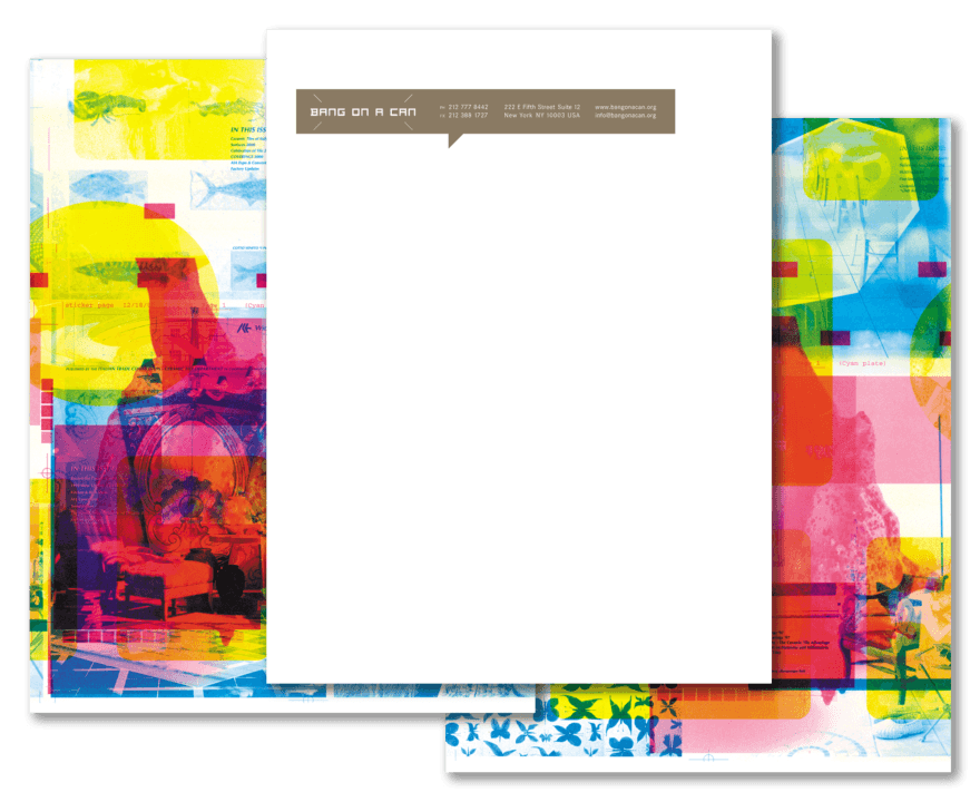
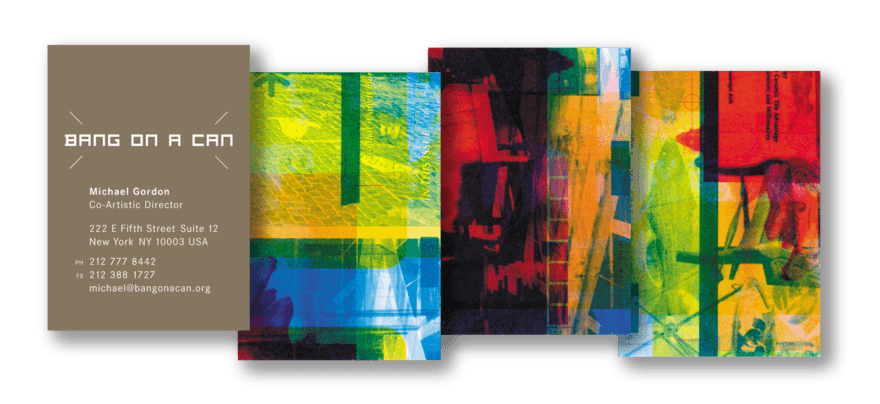
Our relationship began in 2001 with a system which was strategically designed to assuage the diversity of desires and tastes found in any organization. A simple one-color design was backed up with an arrangement designed, by chance, on-site at the printer. Discarded printing plates to be recycled were selected, with one completely different plate per standard color. All identifying logos, text and images were wiped off, then the plates were set up to print. Part of an image would appear on the magenta plate with text from another job on the cyan plate, and so on…
The pressmen became so enthralled by the freedom of this process that they began putting the sheets through the press twice, turning it 180º so as to spread the random imagery evenly. Ultimately, our small non-profit arts organization client found themselves with 10-color business cards — an unheard-of precedent.
Shortly after this project, we began designing packages for Bang on a Can’s label, Cantaloupe Music. The first project was to repackage a collection of recordings which had previously appeared on Sony Music. Titled “Classics,” the album became a great introduction to the overall enterprise and a de facto symbol of the organization.
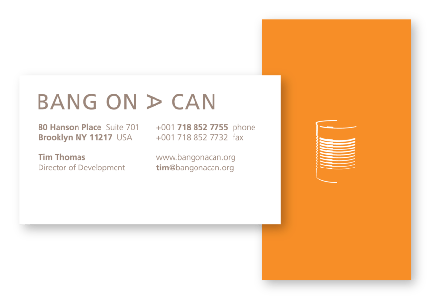
Previous to this album, the group was resistant to any literal interpretation of the words “bang, on” or “can.” But the success of the album, both as product and symbol was compelling. So when they moved to larger offices in Brooklyn, we devised a system in which the can appeared — thus completing the connection with “Classics.”
Where the previous system was based on interpersonal strategy, this used a perceptive strategy. Whenever possible, the reverse side of a page was flooded with a background color, save an overall can silhouette positioned directly behind the “ribs” on the front side. As the page was held up to the light, the subtle combination would complete the can image.
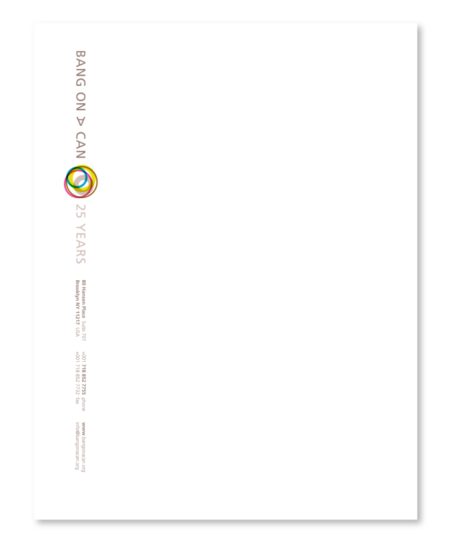
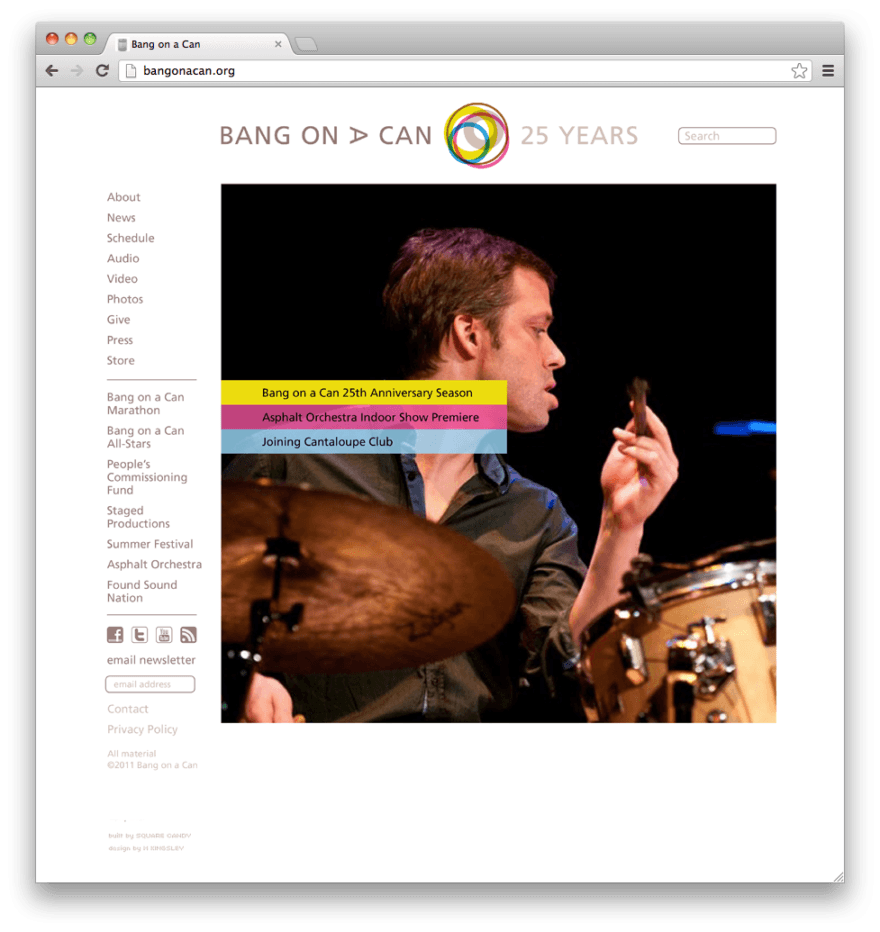
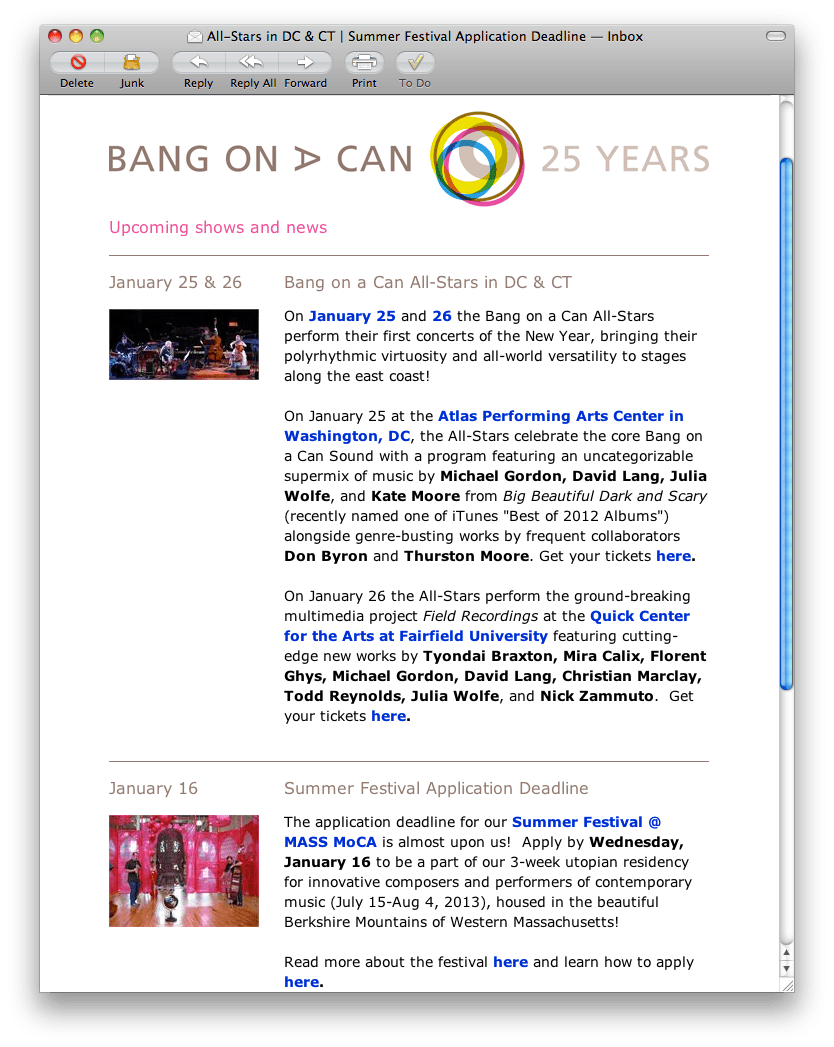
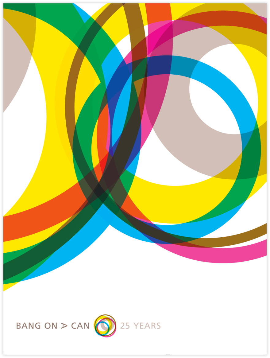
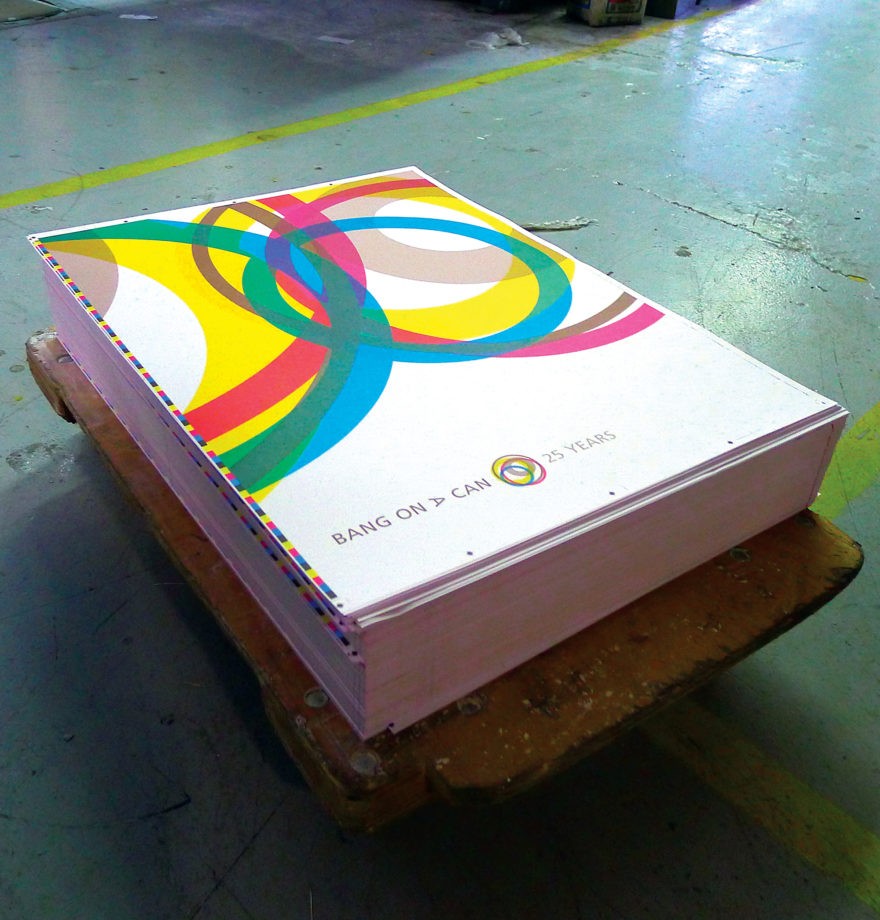
By 2012, as they entered their 25th year, Bang on a Can had fully transitioned from outsider upstarts to established institution — one which encompassed a variety of audiences, locations and aesthetics. To represent this, we looked to the top of an average can…

The resulting mark reflected this variety and sustained enthusiasm. It also felt more like a traditional type of symbol — a topic addressed five years later on their 30th anniversary.
But to this day, the can remains a vital symbol of the organization. It is familiar, but without a label, it also has a certain strangeness. Much like the music they champion.
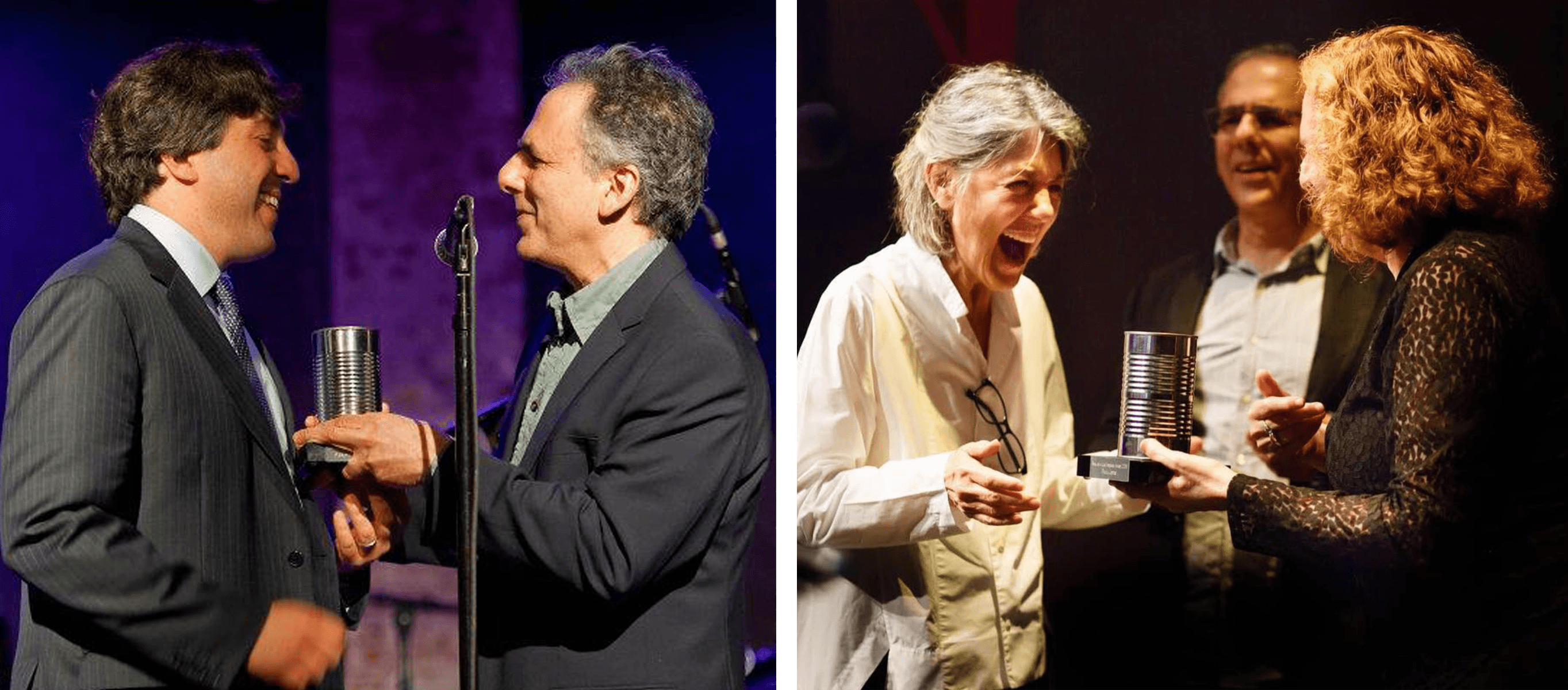
It is also satisfying to see the organization continue to recognize champions and supporters of new music each year with their Visionary Award. There is something refreshing and unstuffy to see people being awarded with a can, mounted upon a base.
